NS Environmental
Website design
Logo design
Briefly
Sussex Soils operated a transportation service, collecting and delivering materials at key points in the production of British Standard topsoil.
Following management changes, the company decided to expand its activities to provide ‘oversize’ compost to the growing Biomass sector.
PMDC was commissioned to create an ‘umbrella’ brand identity that would consolidate the company’s professional reputation within the industry and pave the way for additional, high value services.
What we did
PMDC’s first recommendation was to change the name of the company to one that would more effectively reflect its increasingly diverse activities.
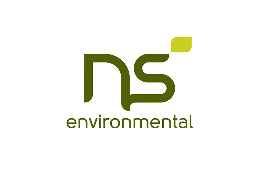
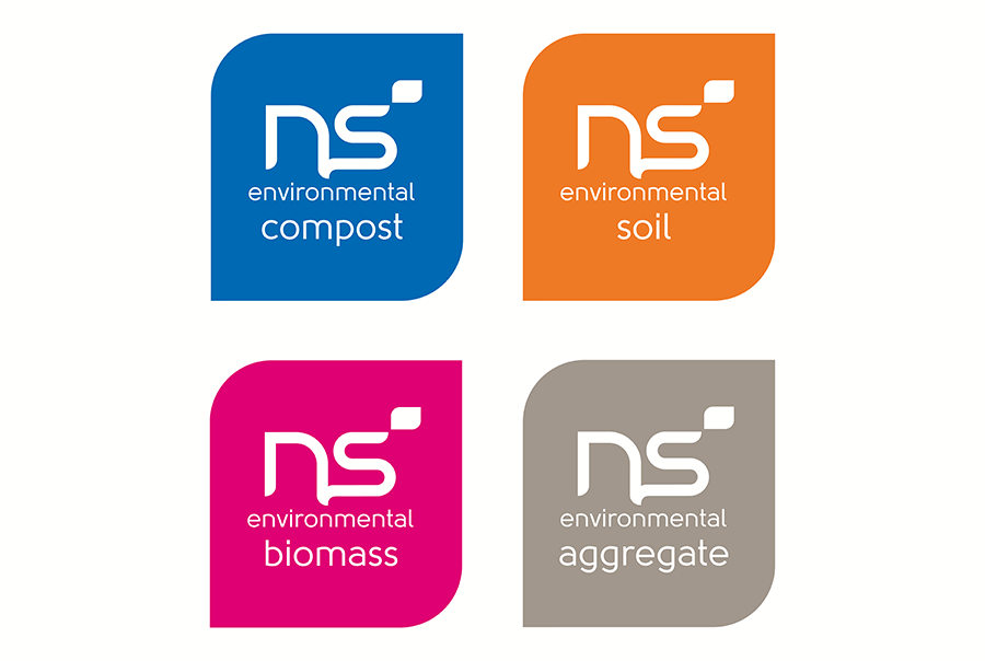
From a wide variety of approaches, NS (Natural Sources) Environmental was felt to best describe the core, and future, specialisms of the business.
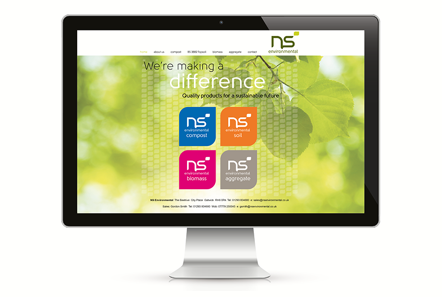
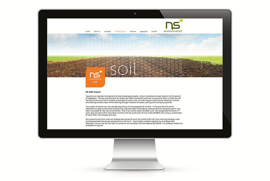
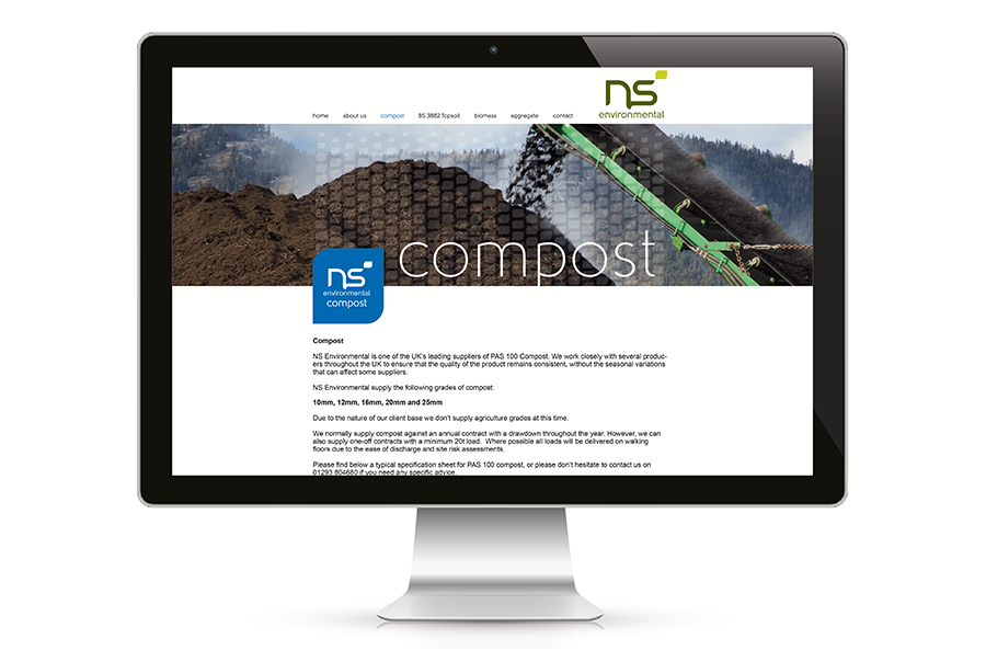
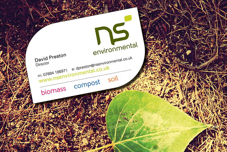
We then developed a unique letterform in which the initials grow, organically, from each other. Differentiation for the various sub-brands is achieved through colour-coding of a stylized leaf motif, delivering a unified, confident and professional image.
The branding is further developed on the company’s website, where it combines with the distinctive sub-brand colours and considered picture sourcing to enliven richly informative content.
http://www.nsenvironmental.co.uk