Wallops Wood
Brand Identity design
Design Guidelines
Signage design
Briefly
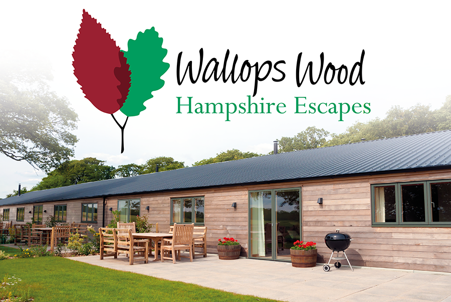
Wallops Wood, once a working Hampshire farm in the beautiful South Downs National Park, has evolved into a base for a thriving collection of SMEs and light industrial businesses. In order to maintain the momentum this achieved, the landowners, the Parker family were inspired to convert more of their disused buildings into holiday lodges, targeting a lucrative, not-too-distant, London market.
Following a Design Council referral and 3-way credentials presentation, pmdc was commissioned to create a brand identity system that would provide individuality to both the business and leisure enterprises, while maintaining a clear visual connection with their shared location.
What we did
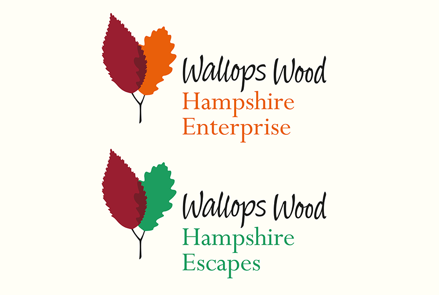
The road to Wallops Wood is characterised by a rich variety of classic English broadleaf trees, so what could be a more natural visual ‘hook’ than a leaf? We used different types of tree to represent business or leisure, subtly ‘grafted’ onto the same stem as a Copper Beech, an impressive row of which guards the Parker family home. A warm and informal hand-written script completes a unique and distinctive logo.