recent work
‘Greece is the word’ for Bere Dairy!
October 7, 2020
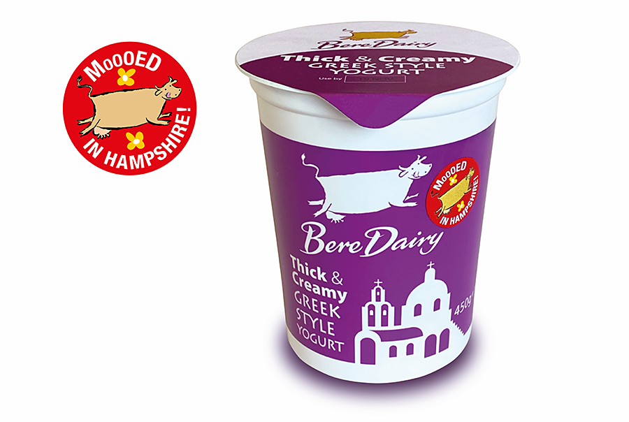
pmdc’s new packaging design for Bere Dairy’s Thick & Creamy Greek Style Yogurt lands on the shelves of local Hampshire stores from this month.
Our ‘Moooed In Hampshire’ sticker successfully endorses Bere Dairy’s local food credentials and will appear on all their yogurt, ice cream and clotted cream.
It certainly brings a twinkle to our ‘lockdown’ eyes and taste buds!
Honesty Bread and Cake packaging
February 7, 2018
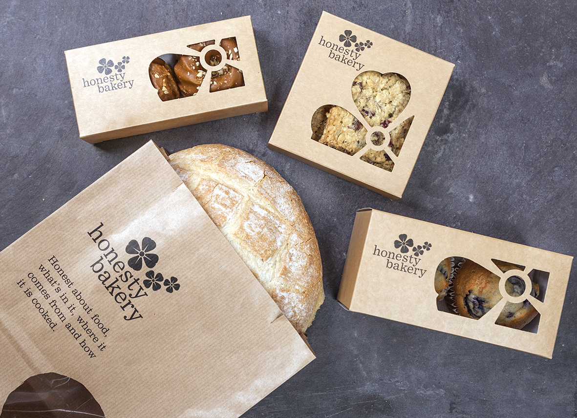
Packaging designs for the Honesty Group’s artisan bakery by PMDC. The brief was simple: a major client has demanded we add in-store impact to our range of breads, cookies cakes and muffins with appealing and appropriate packaging.
Bespoke cartons and bread bags in brown Kraft, with unique-shaped windows reflect the Group’s values of honesty and integrity.
Petersfield remembers
January 22, 2018
![]()
Branding created by PMDC for Petersfield Town Council for a series of events commemorating 100 years since the end of World War 1.
Our concept memorably captures the client’s desire for a marque that reflects the importance of events to both young and old.
Creating a Sweet Sensation
November 28, 2017

Cupcakes “mmm” Cookies is a ‘cakes for all occasions’ business whose existing branding was inhibiting its ambitions to take on larger scale projects.
Pmdc Design was commissioned to ‘grow-up’ the image of the business.
Brewing a better cuppa
November 15, 2017
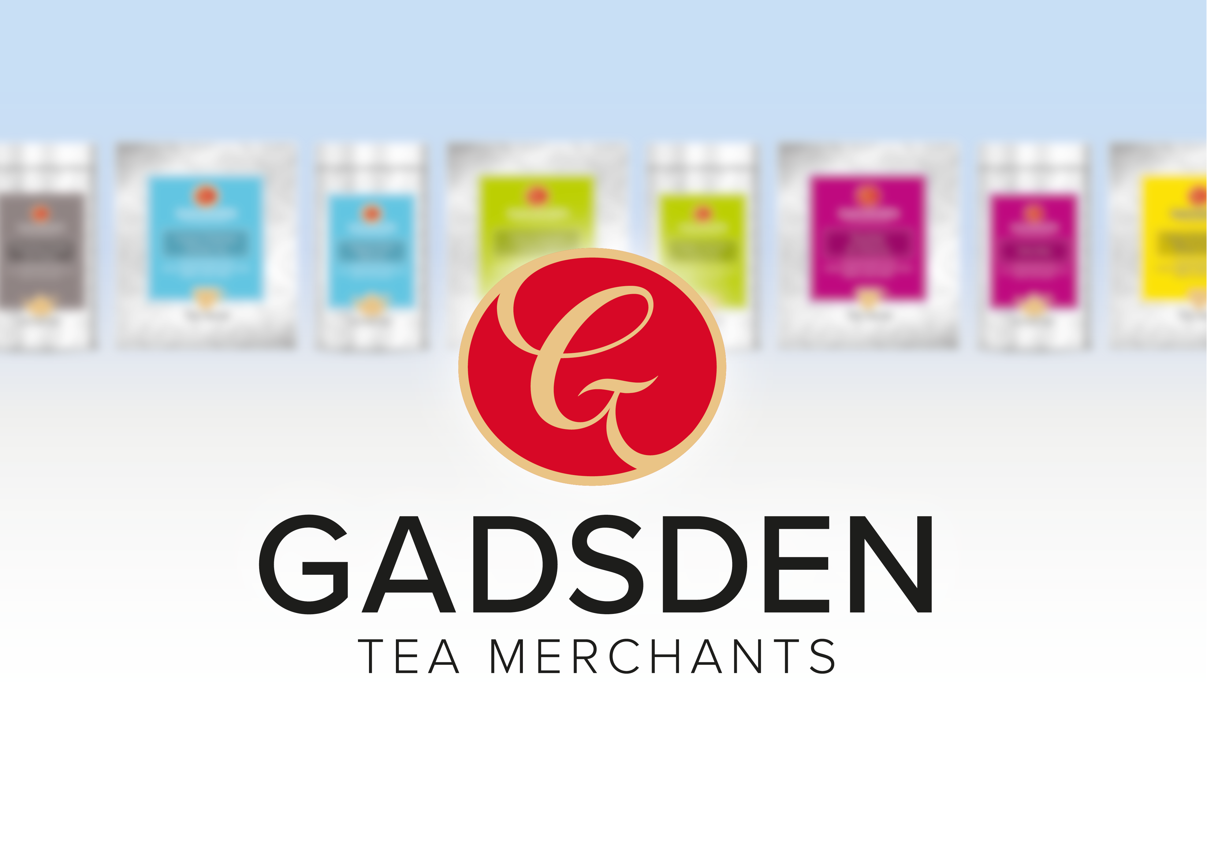
Tea blenders Gadsden (formerly All About Tea), based in Southsea, invited PMDC Design to overhaul their brand identity and packaging. The existing ultra-modern, austere, branding was replaced by a traditional presentation that more faithfully reflects their customers’ mature, conservative profile.
Rebranding is in early stages of implementation. Packaging in the new design will roll out over coming months.
Wildflower Cordials’ Elderflower Drink
July 21, 2017
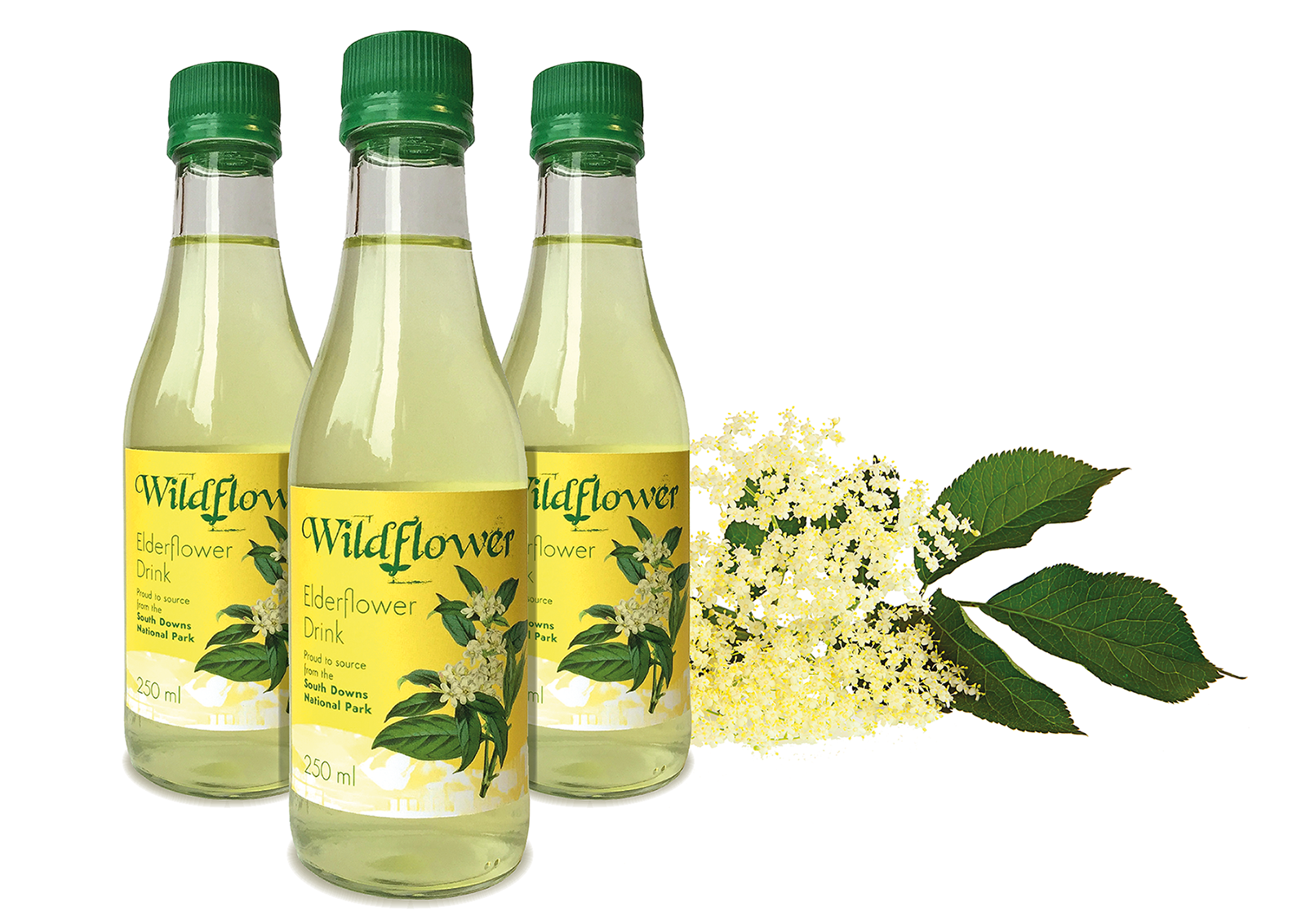
Pmdc have completed a packaging refresh for Wildflower Cordials’ Elderflower Drink.
Made from ingredients foraged in the South Downs National Park and surrounding countryside, the Wildflower range offers flavoursome and refreshing drinks, free from too much sugar.
Chin Chin – time for Gin!
July 11, 2017
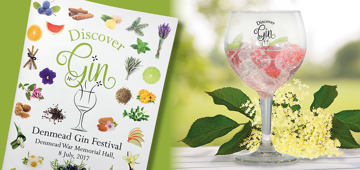
Pmdc has continued its support of the Denmead Gin Festival for a second successful year. Our branding and literature contributed to an idyllic English Summer afternoon where 500-ish happy souls sampled 45 craft Gins to the smooth sound of a jazz band and the heady scent of barbecue. Class and a glass… Already looking forward to 2018!
PMDC serves an Ace in The Avenue
April 10, 2017
![]()
Our identity for Petersfield Town Council’s Tennis courts in The Avenue is set to break!
Confectioner causing a stir
April 7, 2017
![]()
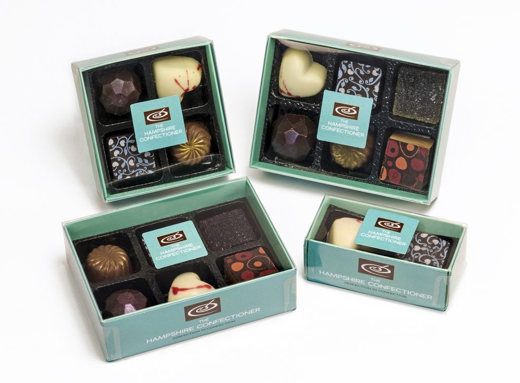
The Hampshire Confectioner is Tyrone Hull, a professional chef breaking into the artisan hand-made sweet treats market. Tyrone invited us to overhaul his brand identity and chocolate packaging. The branding is set to roll out in coming weeks.
The Joy of Juice
February 3, 2017
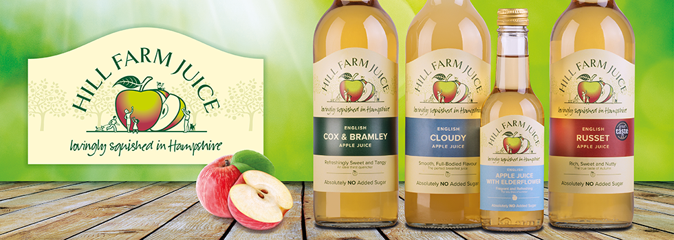
PMDC Design is delighted to reveal its latest design refresh for Hill Farm Juice, 13 years after it first created the brand design (how’s that for Return On Investment, brand owners?).
The new design addresses changes in consumer expectations that demanded a more assertive expression of the brand’s personality.
Shelf presence was further strengthened through improved clarity of the wide variety of flavours offered by the brand.
Vertus HR
January 10, 2017
 Vertus, a start up HR company, commissioned us to create a brand image to reflect the values of the company and its name: excellence; moral virtue; honour; power.
Simple iconography lends added emphasis to the critical element of ‘us’ to the company’s business.
Royale Oceanic Mini Brochure
January 6, 2017
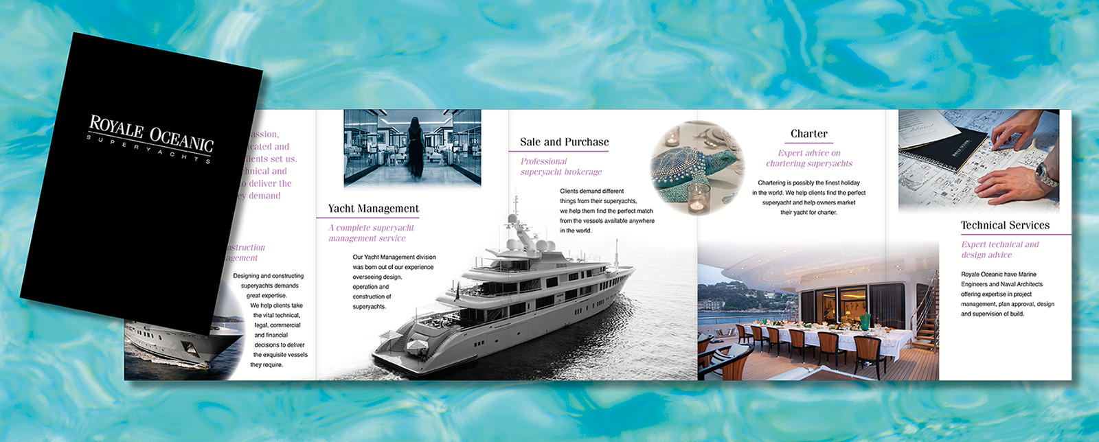
As part of PMDC Design’s ongoing development of internal and external communications, we created a pocket-sized guide to the services offered by Royale Oceanic, specialists in the design, construction and management of luxury superyachts.
The guide was launched at the 2016 Monaco Yacht Show.
Spring’s coming with our new arts brochure for Bedales School!
December 20, 2016
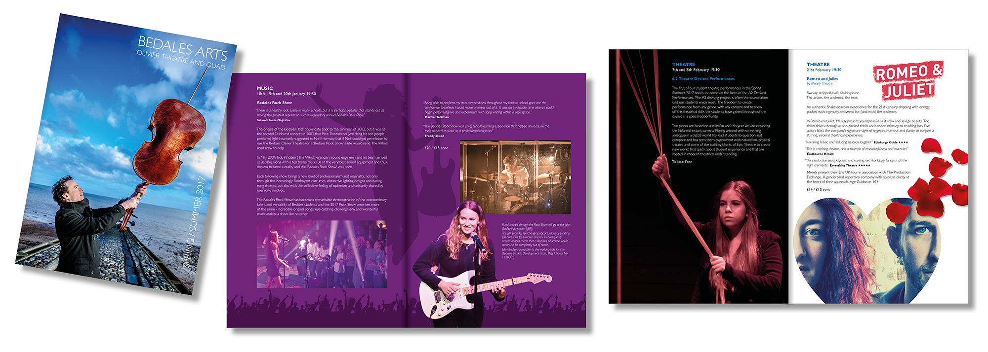
Our newly designed Spring / Summer 2017 arts brochure for Bedales School.
New Autumn arts brochure for Bedales School…
June 28, 2016
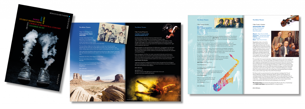
Our newly designed Autumn 2016 arts brochure for Bedales School.
New Spring / Summer arts brochure for Bedales School…
December 16, 2015
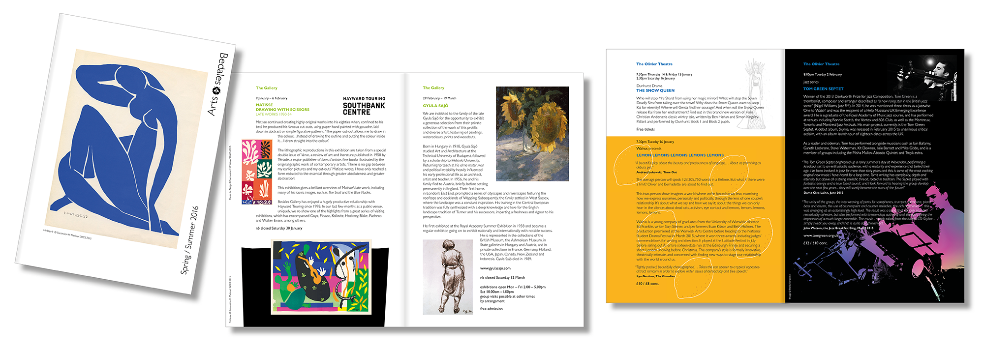 Spring’s coming… honest.
Our newly designed Spring / Summer 2016 arts brochure for Bedales School will help bring it on!
New name, logo and website design for NS Environmental…
November 13, 2015
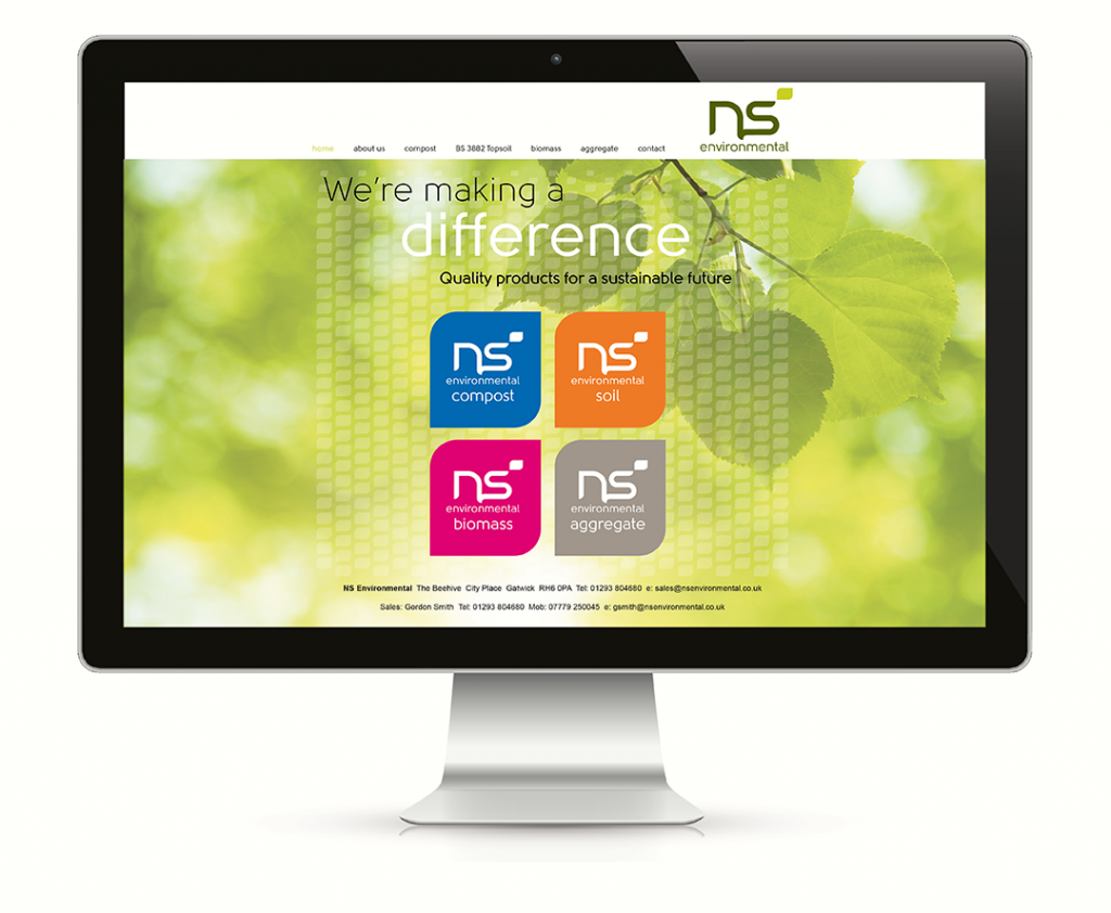
Pmdc has created a new name and new brand identity for NS (Natural Sources) Environmental, a company that currently transports materials at key points in the production of British Standard topsoil.
NS Environmental also has a long-term ambition for organic growth into biomass energy production.
Pmdc’s logo design will build recognition for the company in its transportation activities, but has been designed to achieve a credible presence in the growing biomass sector.
Bere Dairy’s new website is launched…
April 17, 2015
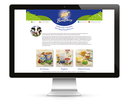
The cow’s got the cream! We’ve just designed Bere Dairy’s new website. See it at www.beredairy.co.uk and read the full story on our brand identity, packaging design and advertising flyers for Bere Dairy’s owner Robert The Yoghurt below!
New website is the Talk of the Town…
March 16, 2015
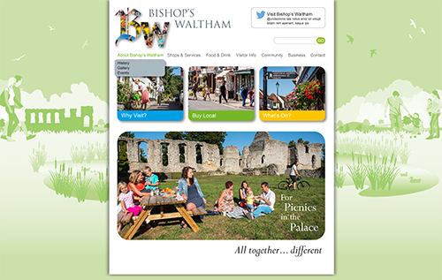
Bishop’s Waltham is a small market town in Hampshire, to be found 12 miles east of Winchester.
Tasked with attracting greater passing trade and prompting a re-evaluation of Bishop’s Waltham, the Town Team enlisted pmdc design to create a brand identity for the town, which will become a focal point for a wide range of internal and external communications.
Pmdc’s design for the town’s new website is up and running!
Bere Dairy’s new advertising and website…
March 9, 2015
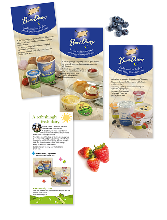
We’ve just designed Bere Dairy’s new advertising flyers and are in the process of redesigning their website. Look out for them in the coming weeks…
If you go down to the wood today…
July 18, 2014
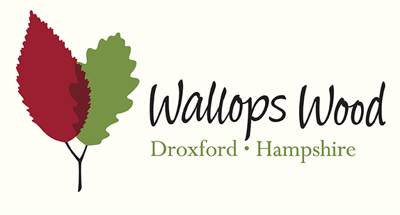
The name may sound fairy tale-like, but Wallops Wood is home for pmdc design. We are based in Wallops Wood, Hampshire, in the beautiful South Downs National Park.
We were tasked with creating an all-encompassing identity for a highly diverse variety of ventures: holiday cottages, a wedding venue and the local business community.
Our design successfully reflects Wallops Wood’s friendly character and rural location, linking the three activities, while simultaneously providing a basis for future enterprise.
Talk of the Town…
April 8, 2014
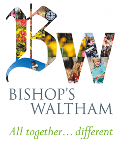
Bishop’s Waltham is a small market town in Hampshire, to be found 12 miles east of Winchester.
Tasked with attracting greater passing trade and prompting a re-evaluation of Bishop’s Waltham, the Town Team enlisted pmdc design to create a brand identity for the town, which will become a focal point for a wide range of internal and external communications.
Drawing on both the town’s medieval heritage and modern development, we created the ‘BW’ monogram that is simultaneously informal and accessible, yet appropriately respectful.
Pmdc takes Hartridges back to its roots
March 12, 2014
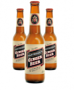
Briefed to position Hartridges on-trade Ginger Beer as an authentic and traditional product, pmdc design created a presentation that recalls and commemorates the brand’s long heritage.
The product will be available in selected outlets from March 2014. Let us know when you spot it!
Down-to-earth design for Rocks
January 17, 2014
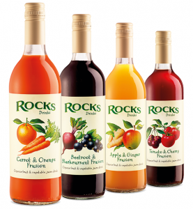
As an extension of our successful work with Rocks Organic Drinks, pmdc design was enlisted to create packaging for a new range of ready-mixed fruit and vegetable ‘fusion’ drinks.
Working with renowned illustrator Fred van Deelen, we took the wholesome, no-frills honesty of the products as our inspiration to create an impactful and very distinctive presentation.
Titley & Marr and pmdc design get back to nature
January 16, 2014
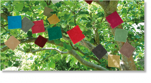
Being designers naturally means that we are closet artists, photographers, and writers, so when our old friends at Titley & Marr challenged us to photograph their stunning fabrics for the new season, we grasped the opportunity eagerly.
Many of T&M’s designs are inspired by nature, so it seemed equally natural to us to take them out of the showroom and back into the landscape.
It’s a simple yet unusual theme. We think the results look, well, entirely natural.
New pmdc design website is launched
January 8, 2014